Font: Futura
Font: Futura
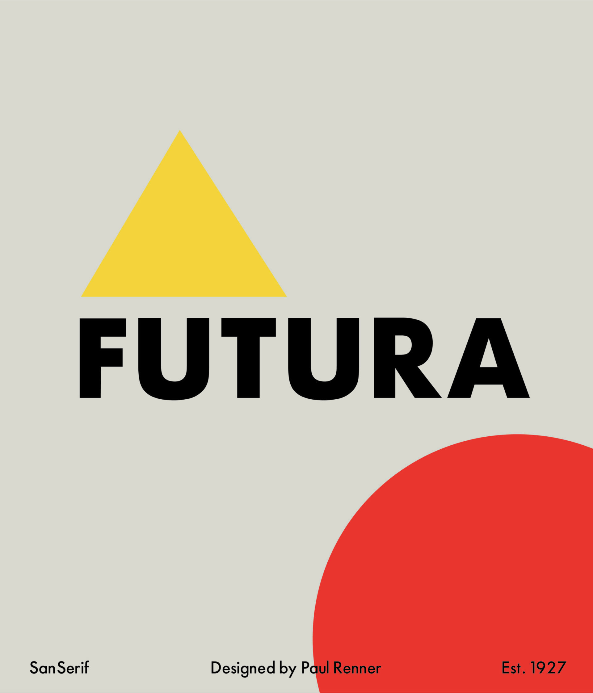
Futura (Few-Tour-Ah) is one of the most popular fonts in the modern world. In fact, it’s one of the most popular fonts, out of the modern world. Futura is what was chosen for the commemorative plaque, left by the crew of Apollo 11… on the moon!
In 1924, decades before Neil Armstrong would take that small step, Paul Renner of the Bauer Type Foundry began work on designing a new style of font. His contribution to design would not be ready for release until 1927. Renner set out with the goal of emulating the geometric, grotesque style of traditional sign painting. He believed that the modern typeface should express modern values, rather than be a redesign of a previous typeface. Showcasing even strokes and tall ascenders, as well as nearly circular bodies, Futura has been popular since its creation.
Due to it’s ease of reading, the Italian Rail System uses Futura for their wayfinding signage and to identify stop locations. From a viewability standpoint, it’s on top in regards to being read quickly from a distance. Futura shows large in tight spaces and makes it the font of choice for placards spread across the cockpit of Boeing’s 747. Futura engraved on the placards allows pilots to reference their gauges at a glance, and is renowned for it’s international clarity and readability. Locally, you’ll find Futura used by UW Milwaukee. That alone should make you a fan!
Paul Brenner set out to create a font that would fit the modern needs of his time, as well as remain usable far into the future. His goal was achieved, as it’s proven to be a reliable choice in the sign industry, and throughout the design world.
Next time you look at the moon, remember to check out the plaque!
Please take a look at our work