The Psychology of Color in Sign Design: Impact on Customer Perception
Let’s dive into the fascinating world of sign design!
As industry experts, we understand that designing effective signs goes beyond aesthetics. It involves a deep understanding of human psychology, particularly how colors can influence perception, emotions, and actions. Let’s explore the psychology of color in sign design and how it can significantly impact your message’s success.
The Power of First Impressions:
First impressions matter, and your sign’s color is often the first thing people notice. Different colors evoke different emotions and perceptions. Let’s delve into some key colors and their psychological effects:
Red – The Color of Energy and Urgency:
- Red is a high-impact color associated with energy, passion, and urgency. It grabs attention instantly, making it an excellent choice for clearance or sale signs. However, be cautious about overusing it, as it can also signify danger or anger.
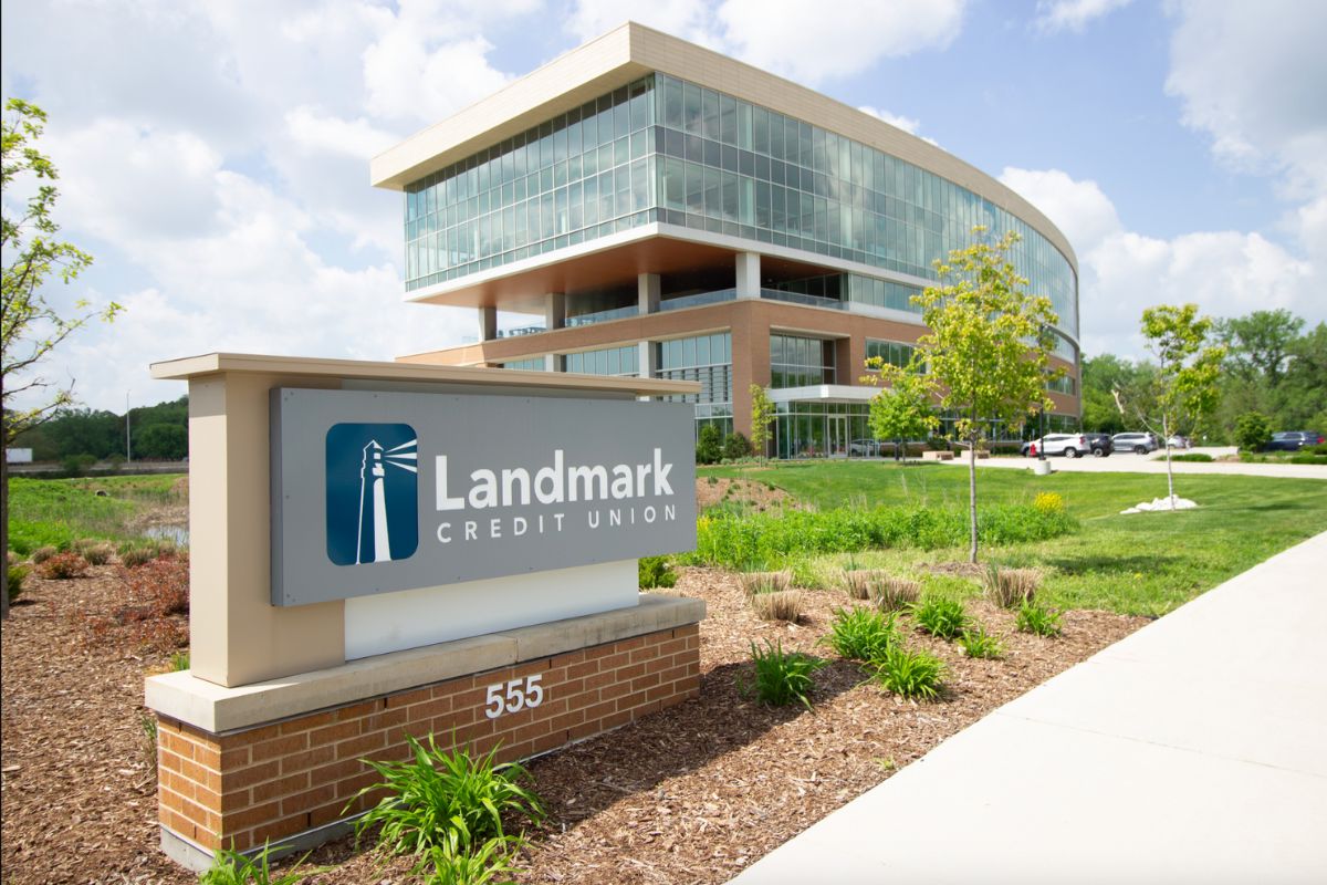
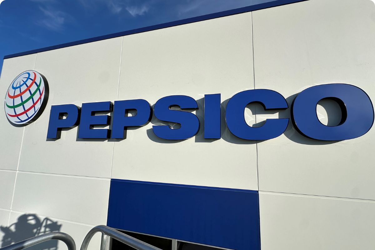
Blue – Trust and Professionalism:
- Blue conveys a sense of trust, reliability, and professionalism. Financial institutions and healthcare providers commonly use it to establish credibility. Consider blue for signs that need to build trust with your audience.
Yellow – Cheerfulness and Optimism:
- Yellow is a bright and cheerful color that radiates positivity and optimism. It’s ideal for attracting attention and creating a sense of enthusiasm. Restaurants often use yellow to stimulate appetite and create a welcoming atmosphere.
Green – Natural and Soothing:
- Green represents nature, growth, and tranquility. It’s perfect for eco-friendly businesses, health and wellness establishments, or any context where a calming and refreshing vibe is desired.
Black and White – Elegance and Simplicity:
- The classic combination of black and white signifies elegance, simplicity, and timelessness. It’s commonly used in luxury branding and high-end retail to convey sophistication.
Orange – Creativity and Fun:
- Orange is a playful and creative color that exudes energy and fun. It’s often used by entertainment venues and brands that want to evoke a sense of excitement.
Purple – Royalty and Luxury:
- Purple has long been associated with royalty, luxury, and creativity. It’s a great choice for brands that want to convey exclusivity and sophistication.
Pink – Femininity and Compassion:
- Pink represents femininity, compassion, and love. It’s commonly used in industries related to women’s health, beauty, and charity organizations.
Sign Design: Importance of Contrast:
- Contrast is essential in sign design. It helps improve readability and ensures that your message stands out. Consider using complementary colors for text and background to enhance visibility.
Cultural and Contextual Considerations:
- Keep in mind that the psychological effects of color can vary across cultures. What may symbolize one thing in one culture might mean something entirely different in another. Be aware of your target audience’s cultural sensitivities.
Testing and Adaptation of your Sign Design:
- Finally, don’t be afraid to experiment and adapt your sign’s color scheme. Conduct A/B testing to see which color combinations resonate best with your audience. The psychology of color is not one-size-fits-all, so fine-tuning is often necessary.
In sign design, understanding the psychology of color is a powerful tool. By choosing the right colors that align with your message and brand, you can create signs that leave a lasting impact on your audience. Remember, it’s not just about what looks good; it’s about how your signs make people feel and act.