Typography faux pas: Common mistakes to avoid in brand fonts
When it comes to establishing your brand’s presence, signage is a powerful tool. It’s the face of your business, welcoming customers and conveying essential information. One of the key elements that can make or break the effectiveness of your signage is the choice of sign fonts. Fonts are not just letters; they are the voice of your brand. As a business owner, you want your signage to leave a lasting impression and build brand recognition.
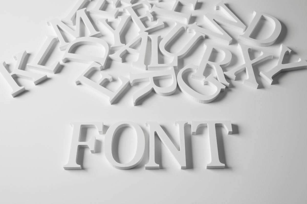
Let’s explore some common mistakes to avoid when selecting fonts for your business signage. Trust us, we’re experts. Whether you’re designing a storefront sign, banners, or promotional materials, steering clear of these pitfalls will help you make a strong and memorable statement.
1. Neglecting Consistency in Your Sign Fonts:
– Mistake: Using multiple fonts for different signage materials.
– Solution: Stick to one or two consistent fonts to build brand recognition.
2. Choosing Overly Trendy Fonts:
– Mistake: Opting for fonts that are currently trendy but may not stand the test of time.
– Solution: Select timeless, classic fonts that won’t go out of style.
3. Poor Readability:
– Mistake: Using overly decorative or complex fonts that are hard to read from a distance.
– Solution: Prioritize readability, especially for signage meant to convey essential information.
4. Ignoring Brand Personality in Your Sign Font:
– Mistake: Not aligning font choices with your brand’s personality and values.
– Solution: Ensure your fonts reflect your brand’s identity and messaging.
5. Sign Font Scaling Issues:
– Mistake: Choosing fonts that lose clarity when scaled up for large signage.
– Solution: Test fonts at various sizes to ensure they remain legible.
6. Inconsistent Spacing:
– Mistake: Poor spacing between letters (kerning) or words can make the text look awkward.
– Solution: Pay attention to spacing details for a polished appearance.
7. Color Clash in Your Sign Font:
– Mistake: Using font colors that clash with the background or don’t align with your brand’s color palette.
– Solution: Select font colors that provide contrast and complement your brand colors.
8. Lack of Versatility:
– Mistake: Choosing a sign font that works well only in specific situations.
– Solution: Pick fonts that are versatile and suitable for various signage types.
9. Disregarding Licensing:
– Mistake: Using fonts without proper licensing, which can lead to legal issues.
– Solution: Purchase or use fonts with appropriate licenses for commercial purposes.
10. Forgetting Accessibility:
– Mistake: Neglecting font choices that may not be accessible to all, such as those with visual impairments.
– Solution: Ensure fonts are accessible by following accessibility guidelines.
Remember, your brand fonts play a crucial role in conveying your business identity, so choose them wisely for your signage to make a lasting impression on customers. Avoiding common font mistakes is essential to ensure your signage stands out, communicates effectively, and represents your business in the best light.
Consistency, readability, and alignment with your brand’s personality are key. And if you’re looking for a signage partner in Southeastern Wisconsin, look no further than Innovative Signs.