Can You Read Me Now?
[fusion_builder_container type=”flex” hundred_percent=”no” equal_height_columns=”no” hide_on_mobile=”small-visibility,medium-visibility,large-visibility” background_position=”center center” background_repeat=”no-repeat” fade=”no” background_parallax=”none” parallax_speed=”0.3″ video_aspect_ratio=”16:9″ video_loop=”yes” video_mute=”yes” border_style=”solid”][fusion_builder_row][fusion_builder_column type=”1_1″ layout=”1_1″ background_position=”left top” background_color=”” border_color=”” border_style=”solid” border_position=”all” spacing=”yes” background_image=”” background_repeat=”no-repeat” padding_top=”” padding_right=”” padding_bottom=”” padding_left=”” margin_top=”0px” margin_bottom=”0px” class=”” id=”” animation_type=”” animation_speed=”0.3″ animation_direction=”left” hide_on_mobile=”small-visibility,medium-visibility,large-visibility” center_content=”no” last=”true” min_height=”” hover_type=”none” link=”” border_sizes_top=”” border_sizes_bottom=”” border_sizes_left=”” border_sizes_right=”” first=”true”][fusion_text]
Imagine this: You’ve just gotten a great reference for a new children’s dentist in your area. You’ve called, made appointments, and took down all the information for the office. You load up the kids in the minivan, plug the address in the GPS and head out for their appointments. Eight minutes and a few turns later, that familiar voice on GPS says you’ve arrived at your destination. You look to your left, you look to your right and there are A LOT of buildings– Where is this place?? Unable to stop in the middle of traffic, you keep driving, then turn around as instructed by GPS and this time carefully scan the buildings to see if you’re in the right spot. Nope, nothing. Now the kids are getting anxious, you’re looking at the clock, you’re already late and now you have to pull over and double-check. You’re SURE you wrote it down right. You DO have it right, but WHERE is this office? Ten more minutes pass and out of pure frustration, you just keep on driving and head back home.
“Am I in the right spot?” “What does that sign say?” or “GPS says it’s right here, but I can’t find it” – Does that sound familiar to you?
It just might – many Americans drive right by and fail to find a business due to poor signage communication.
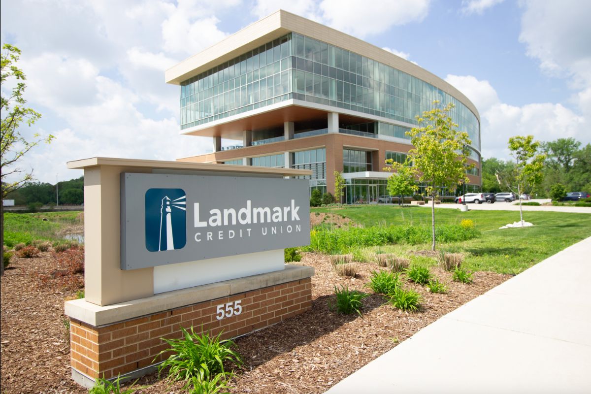
What if there had been a clear, easy-to-read sign directing you to the right place?
If you’re a business owner, don’t lose customers. It might just be time to update your signage communication. According to a study at the University of Cincinnati, potential customers ARE just driving by.
University of Cincinnati – Linder College of Business Study results
https://business.uc.edu/news/departments/marketing/2013/sep/kellaris-signage-research.html
SIGN SURVEY SAYS:
64% of American shoppers report that they have driven by and failed to find a business due to signage communication failure. This number is up from 49.7% in 2011 and 60.8% in 2012.
What makes signs difficult to read? This year’s survey provides answers from the consumer’s perspective.
Top Ten Things That Make Signs Difficult to Read
1 – The letters are too small. (83.3%)*
2 – The placement of the sign makes it hard to see. (71.4%)
3 – The sign is not sufficiently lit at night. (63.6%)
4 – The color of the letters does not stand out from the background. (60.3%)
5 – Digital signs change the message too fast. (52.6%)
6 – The letters use a fancy font. (47.8%)
7 – The letters are spaced too close together. (35.6%)
8 – The sign looks very similar to other signs nearby. (34.4%)
9 – There are distracting visuals on the sign. (31.7%)
10 – Miscellaneous “other.” (1.6%)
Source: Kellaris, J.J. (2013). “Additional Insights from the BrandSpark/Better Homes and Gardens American Shopper Study: A Three-year Longitudinal Update. “National Signage Research and Education Conference, Cincinnati, OH.
*Percentages represent the proportion of consumers citing each item in response to the prompt “when a sign is difficult to read, it’s usually because…”
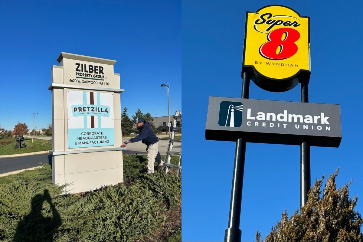
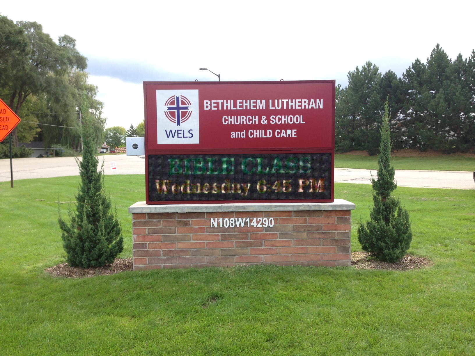
Don’t lose out on business opportunities. Let Innovative Signs help you with your signage communication needs. Contact us today to get started!
[/fusion_text][/fusion_builder_column][/fusion_builder_row][/fusion_builder_container]